
IxDA Interaction 19 Conference
Interaction Design | UX Design
The Interaction Design Association (IxDA) is an interaction design focused member-supported organization. Each year, they host upwards of 1,500 designers for a conference week packed full of workshops, talks, and networking events.
Project overview:
IxDA wanted to create a native mobile app for their Interaction 19 conference. To stand out amongst the other many design conferences, IxDA’s desire is to provide the most rewarding experience possible to attendees in an enjoyable and easy to use native app.
Role: UX Designer, UX Researcher, Prototyper, Strategy
Timeline: 10 weeks
Tools: Paper & pen, post-its, Google Forms, Trello, Sketch, Principle, InVision
Skills: Rapid sketching, UX plan, user surveys, prototyping, user testing, design thinking
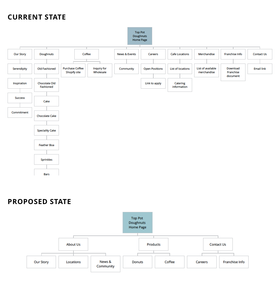
Research & UX plan
The vision statement for the Interaction 19 conference was to create an integrated conference experience that balances innovation and usability and reflects the values and interactive spirit of the conference.
My team and I designed a Google Survey to understand what draws attendees to engage in the conference experience before, during and after the event. We screened all survey participants to be currently working in design or tech, and have attended a conference over the past three years, or a strong desire to in the near future.
CLICK HERE to view the survey.
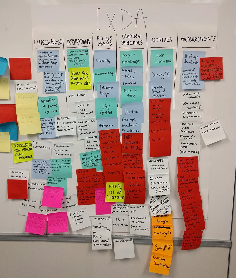
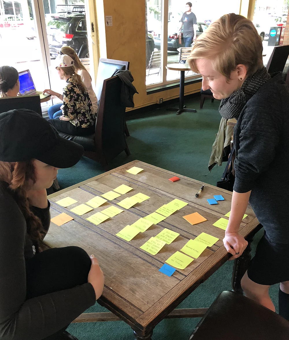
After pushing our survey out to various Interaction Design communities online among Reddit, Slack groups, and Facebook, our efforts resulted in 31 survey participants. From there, we began analyzing the results and pulling out goals and known pain points. Affinity mapping was performed to group user goals and pain points in order to prioritize feature planning for our conference app. Wayfinding, networking, and exploring desired content and events were found to be a priority for attendees.
Ideation
After hearing from conference attendees, we prioritized a foundational conference app that will enable an innovative, integrated experience for attendees. Data from the design community gathered in our surveyed informed focus on a customizable schedule, helping attendees locate exactly where events are taking place, and assist in forging a connection between other conference attendees.
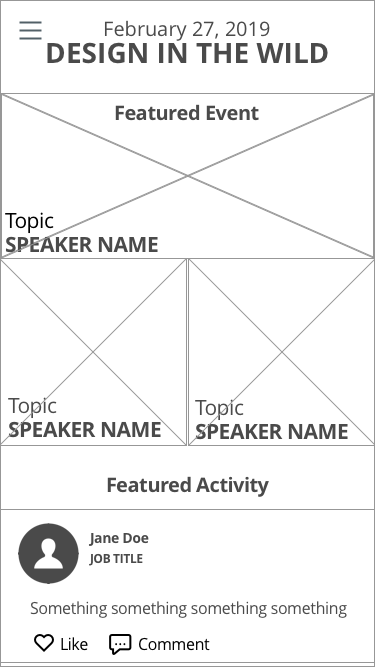
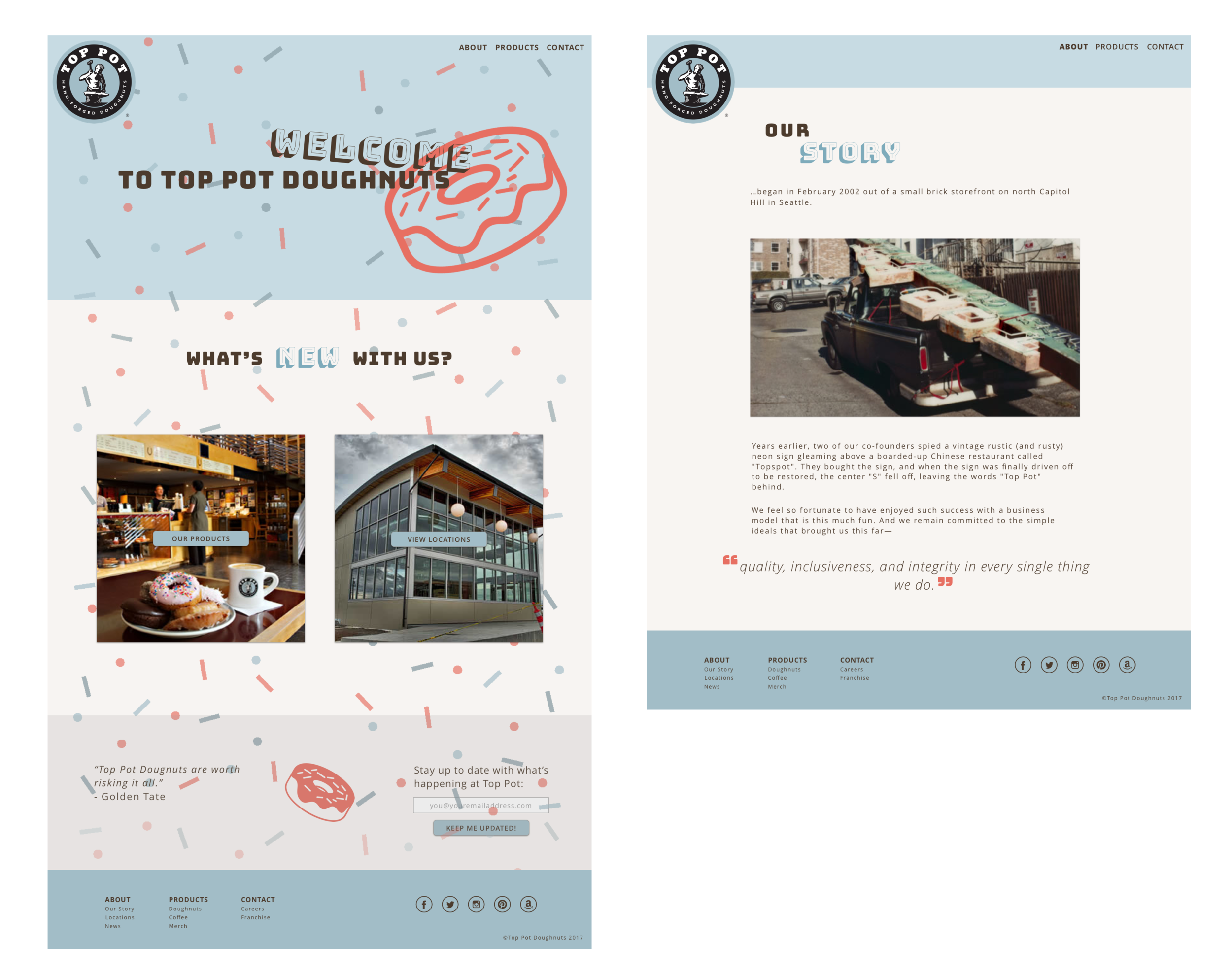
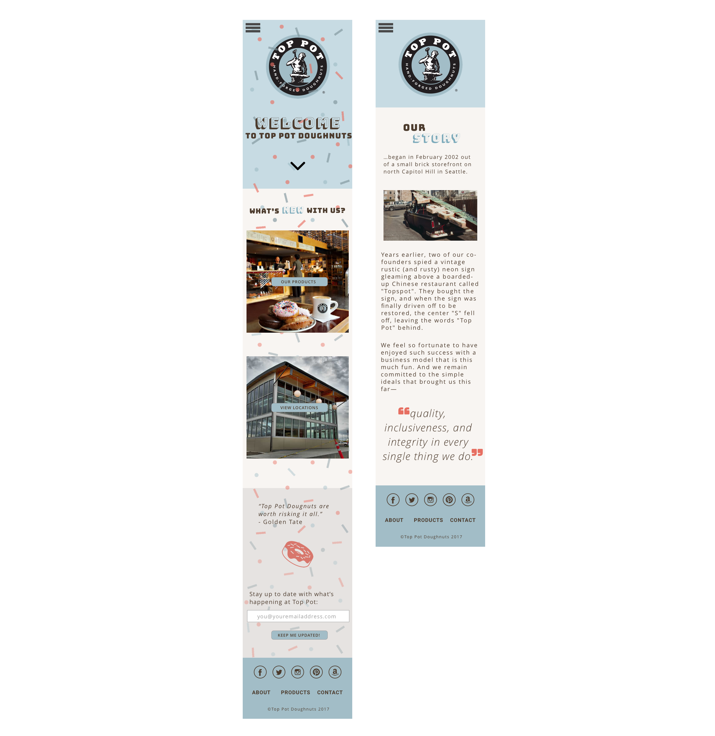
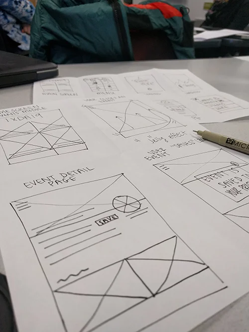
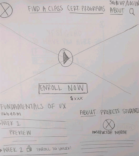
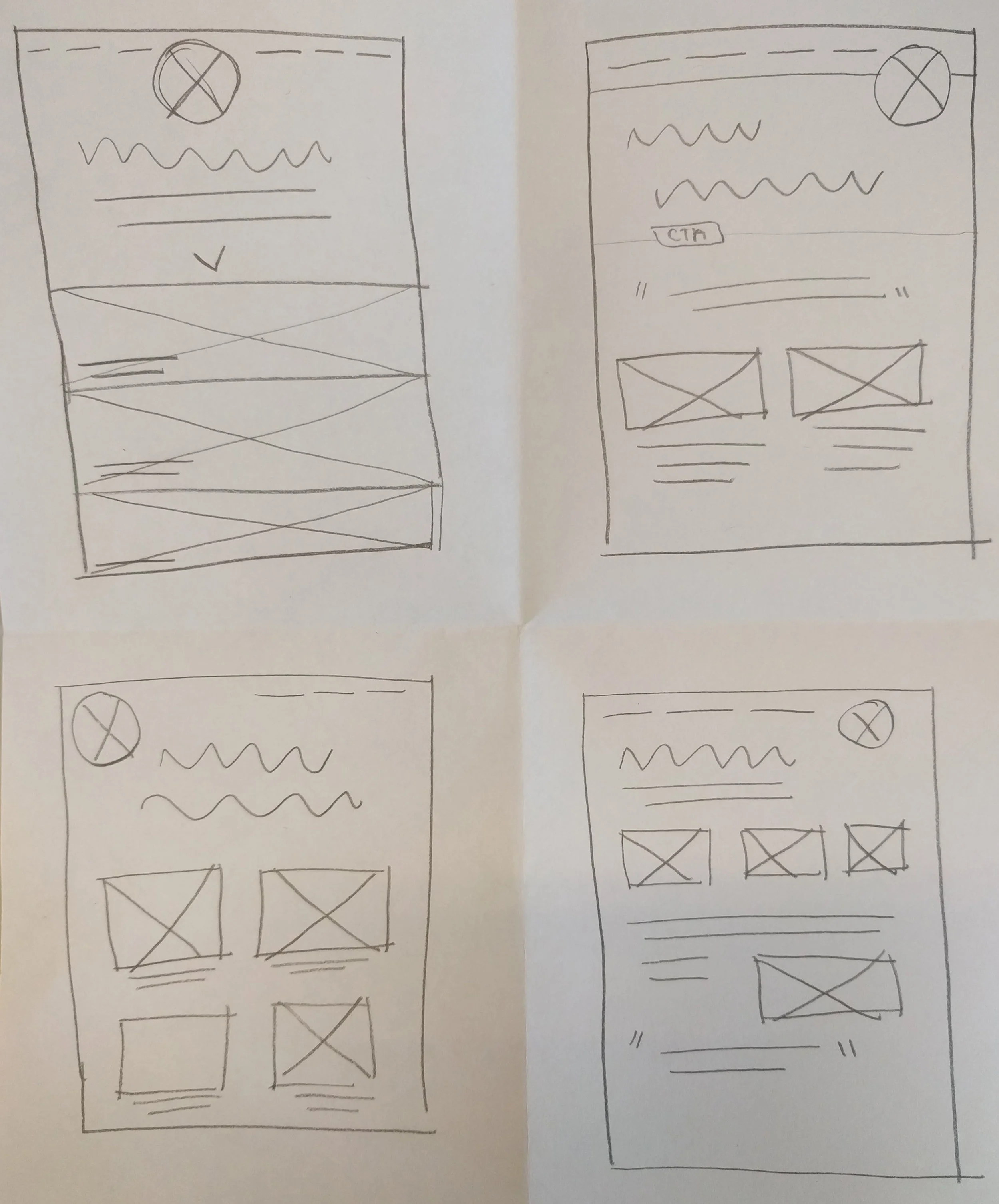
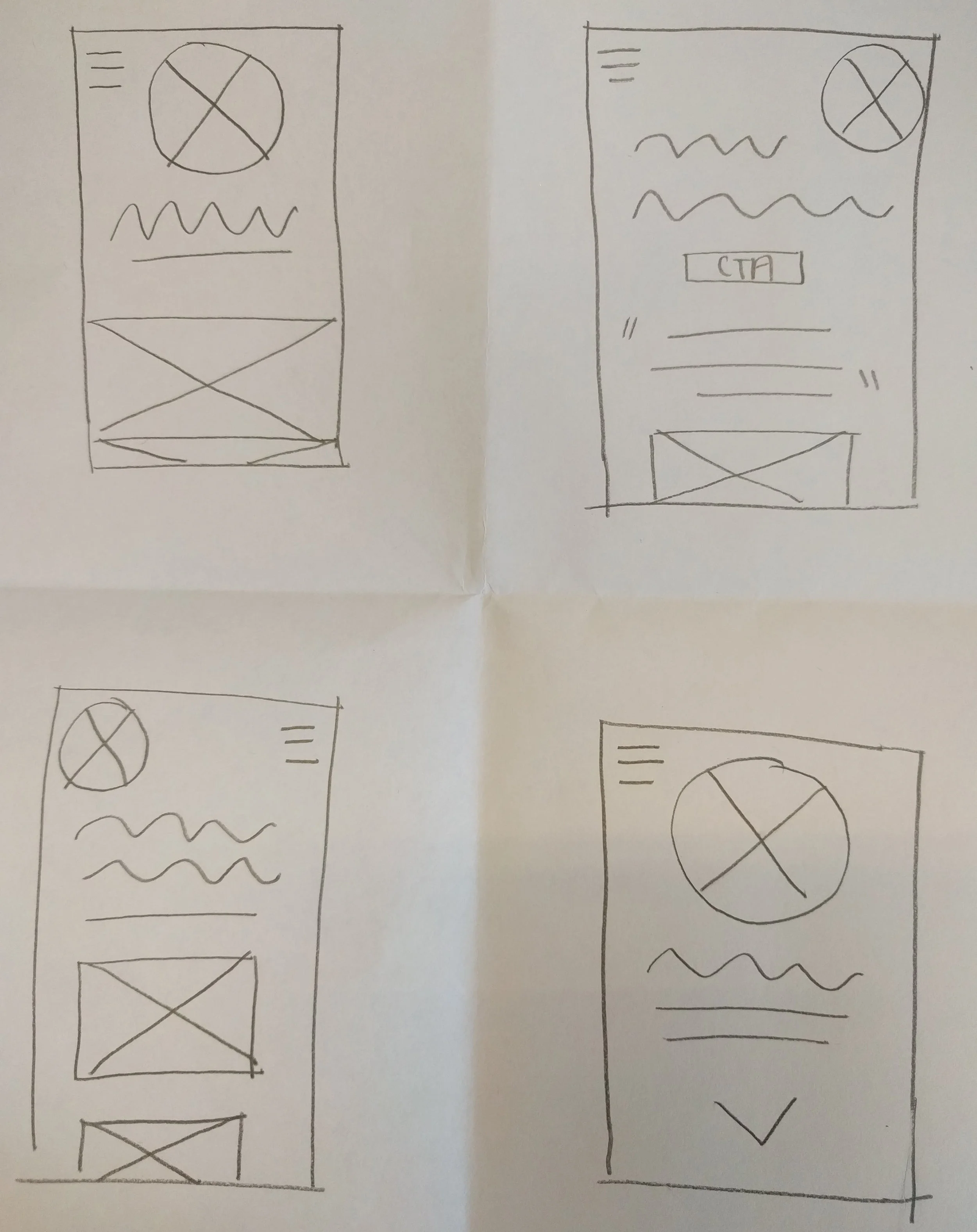
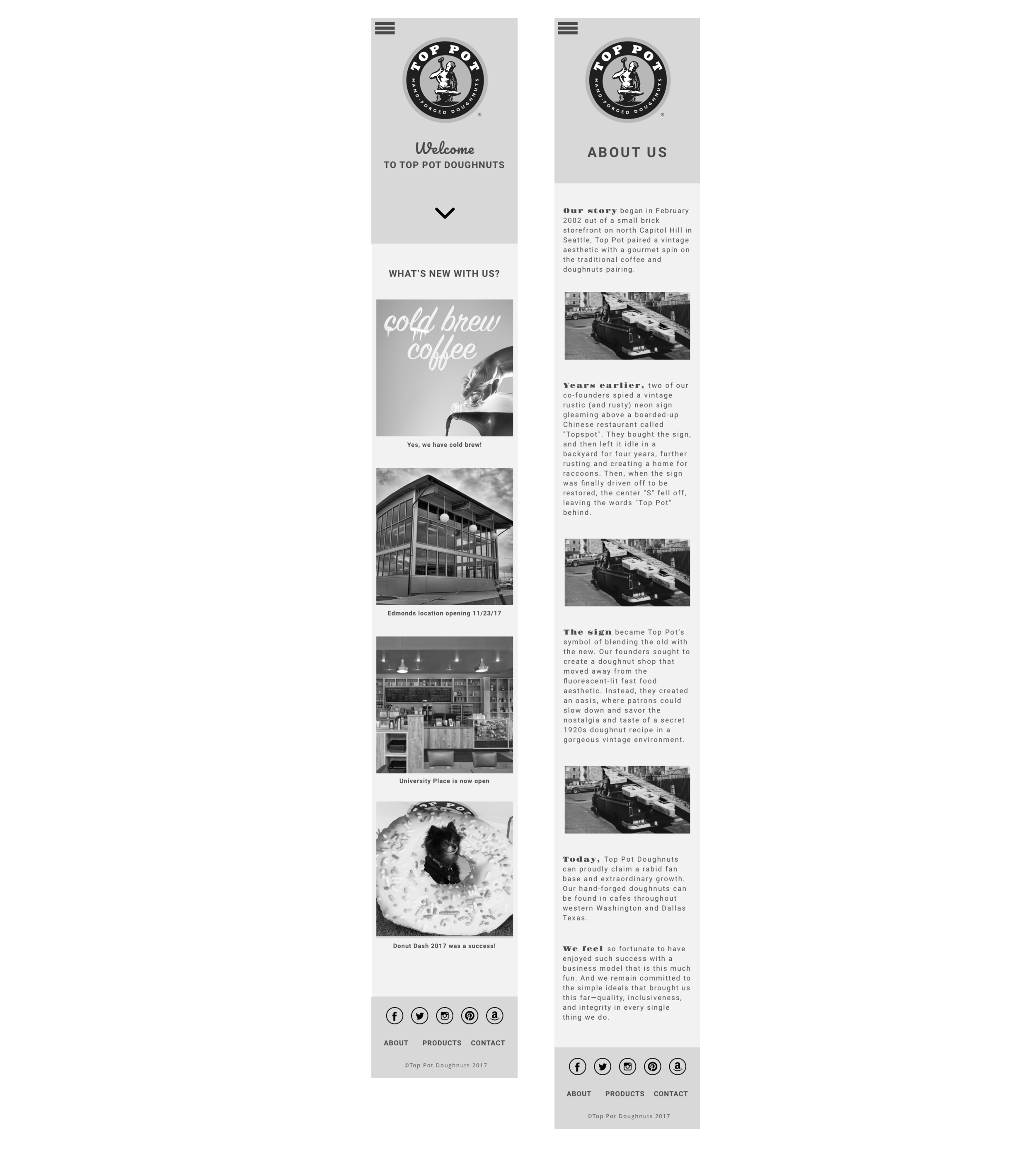
Wireframe of homepage layout option
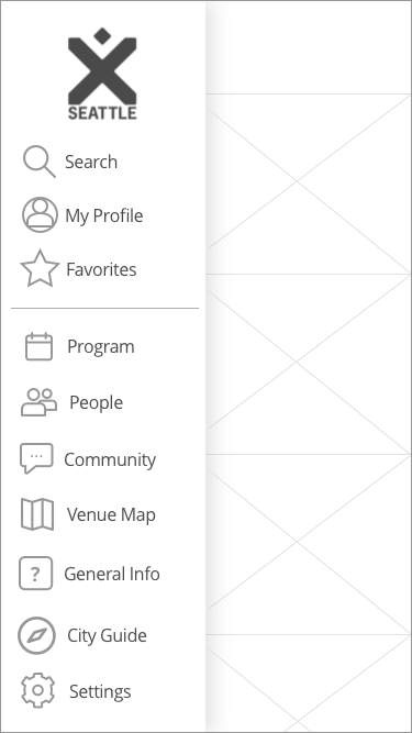
Wireframe of menu with prioritized items
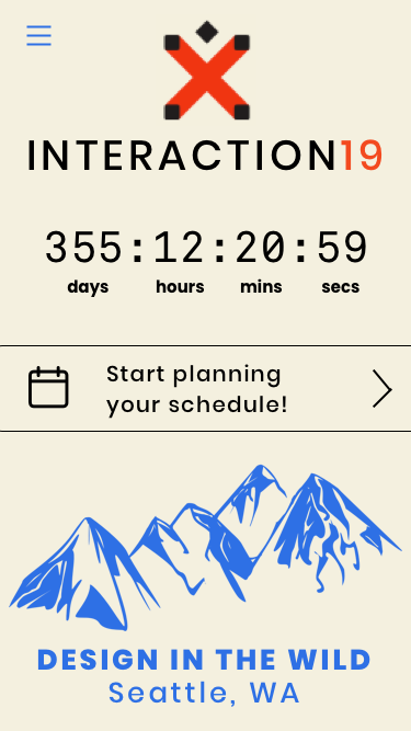
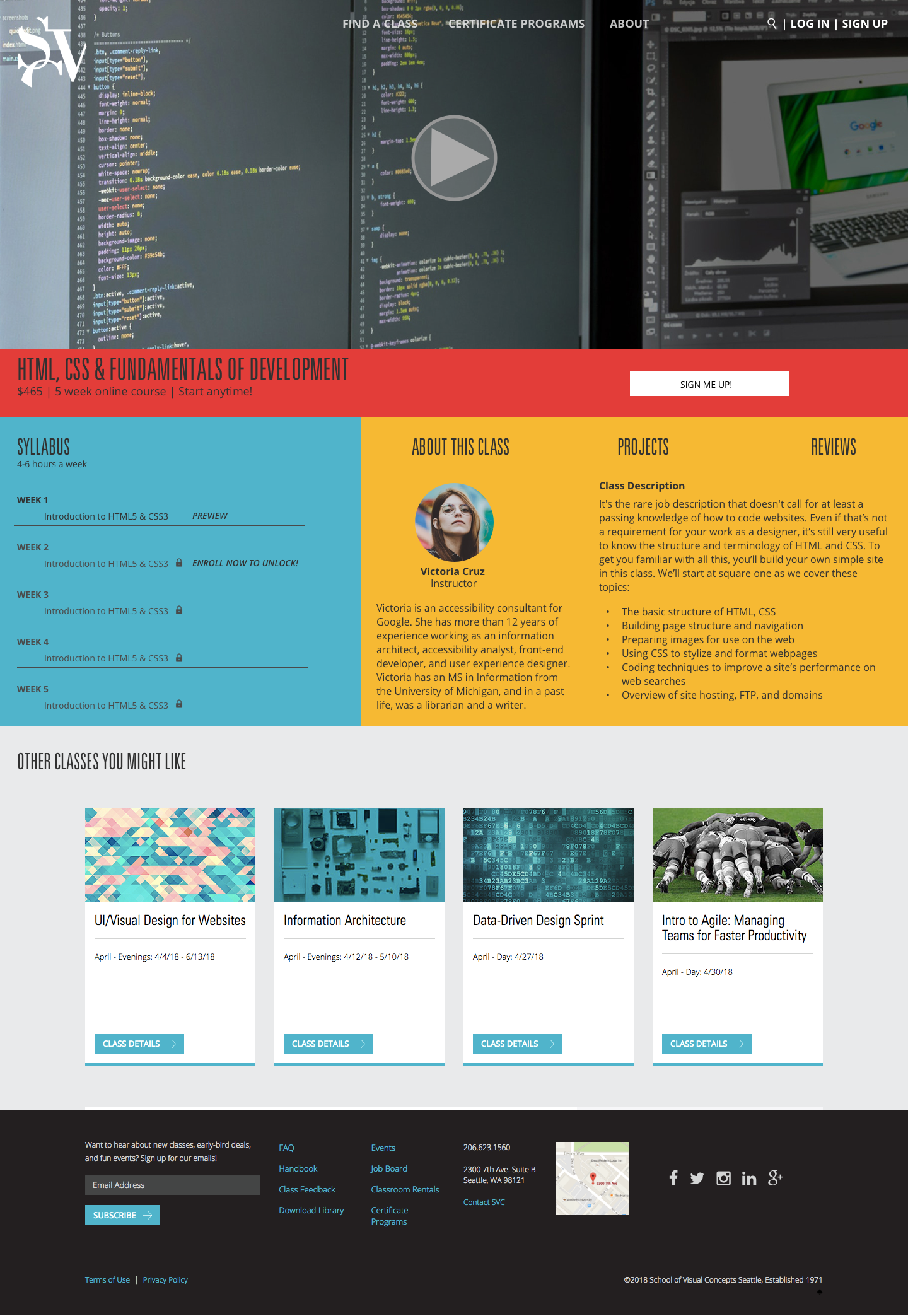
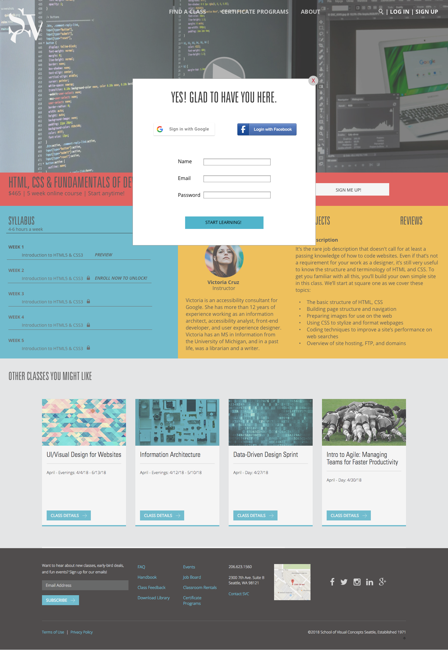
High-fidelity pre-conference call to action with a countdown timer to the event
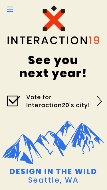
High-fidelity post-conference screen to encourage interaction with post-conference content
During testing, the prototype was well received and users only questioned copy such as the usage of "Program" vs "Schedule." We integrated these changes alongside our mid and high fidelity versions of the screens.
Interaction design
Foundational prototype in hand, my team and I had a midway check in with our client. Since our research had told us that attendees desire a simple, easy-to-navigate conference experience, I narrowed in on the user flows and made sure there were no dead ends or barriers to entry for the conference experience.
The client felt that because of this foundational approach, we were behind on the brief and needed to focus more on interaction design in order to deliver. I held a design thinking session with my team and doubled down on our strongest features to flesh out exciting, interactive experiences for conference goers to fully experience the conference environment.
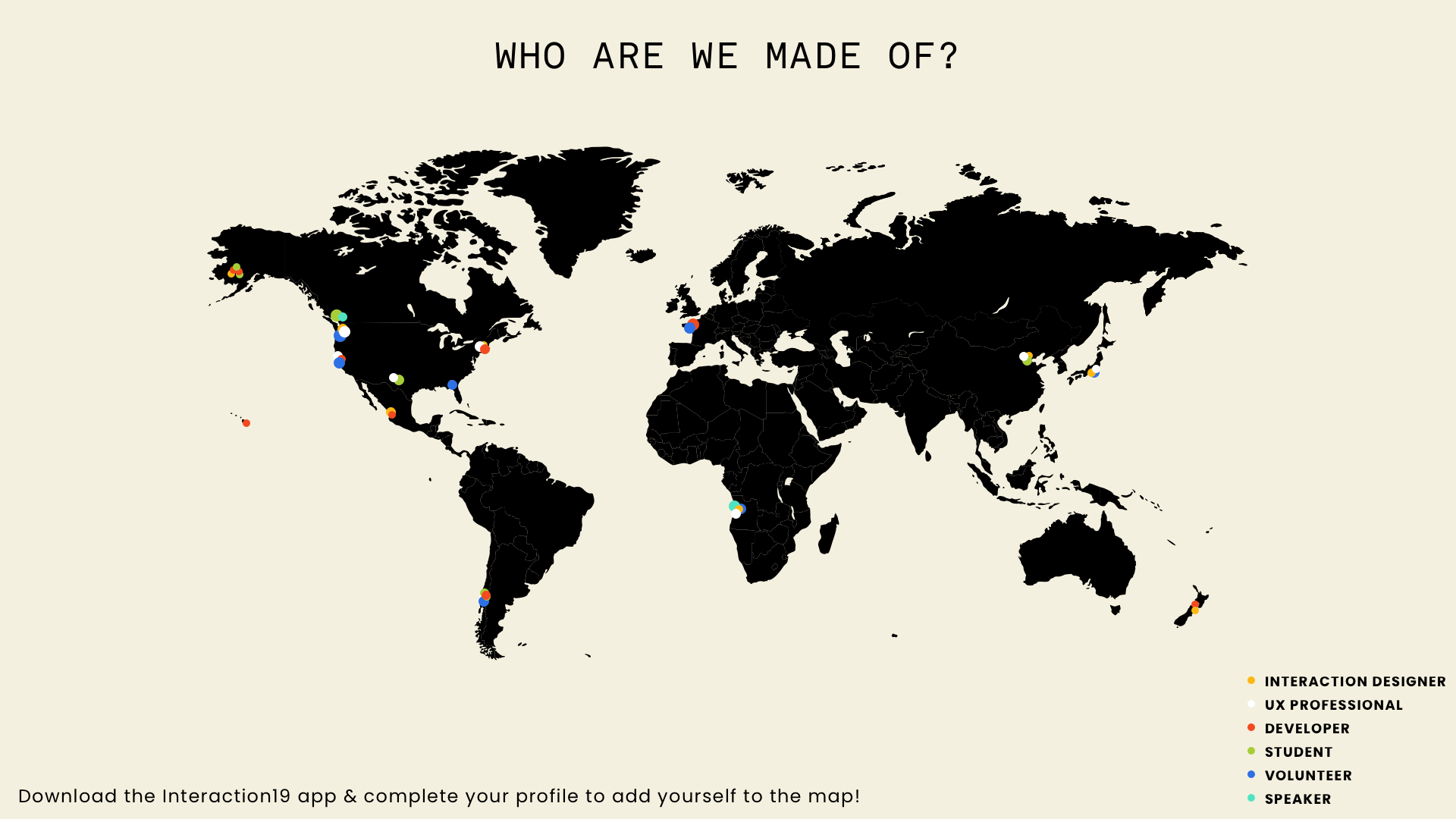
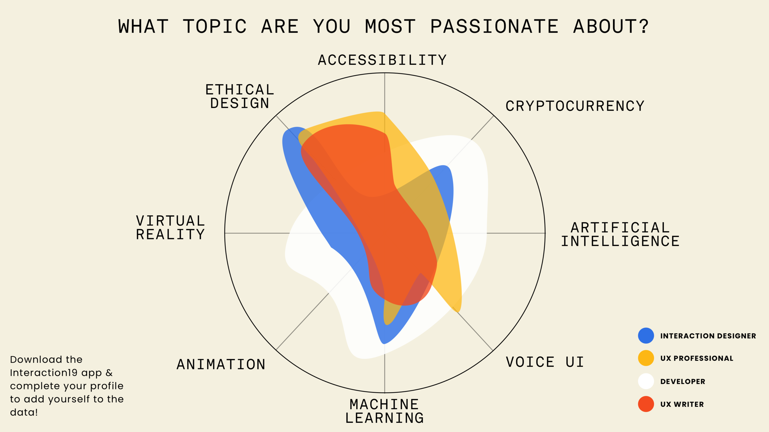
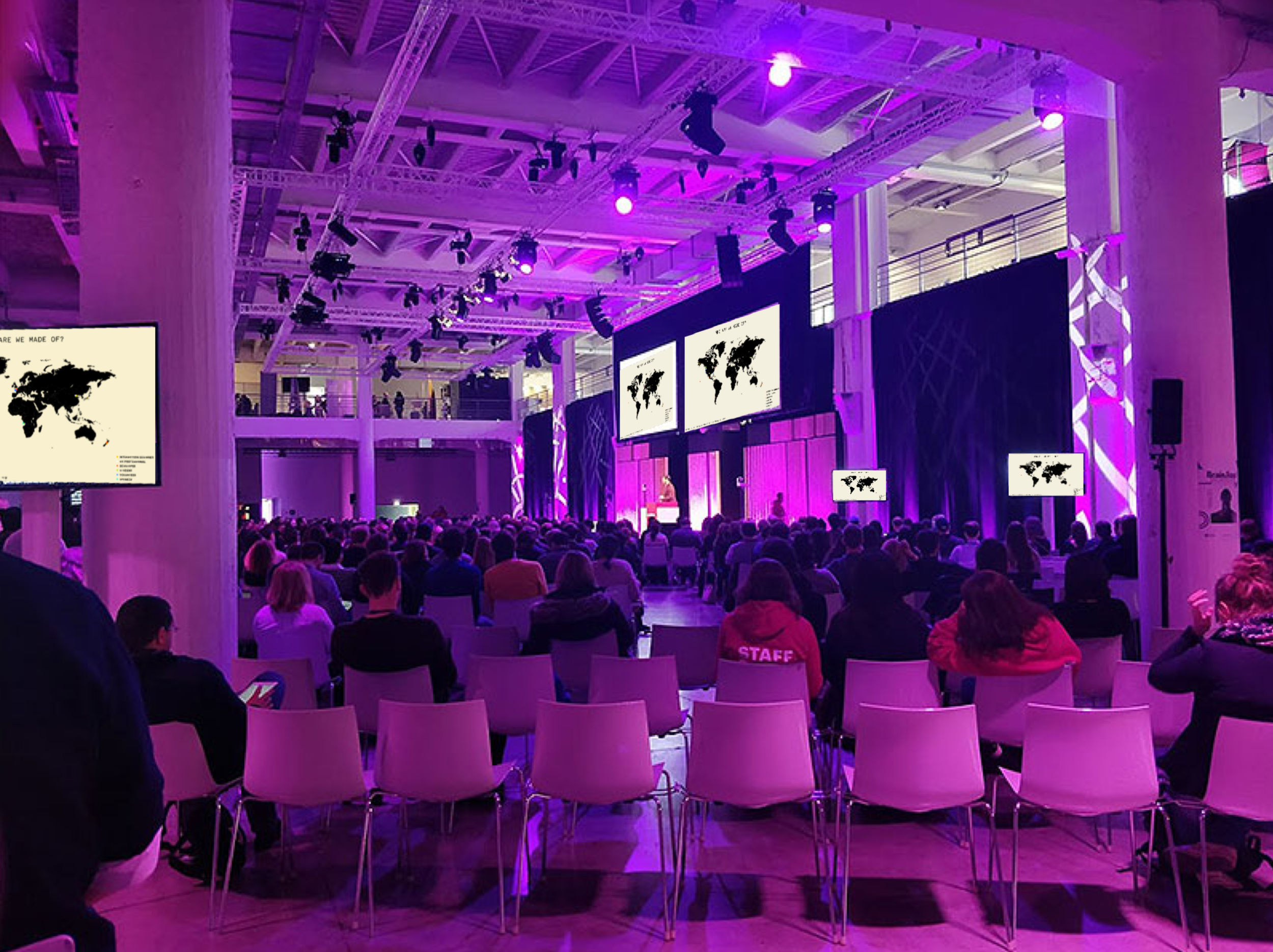
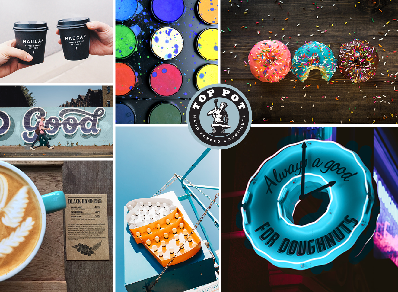
DATA VISUALIZATION: Visual data driven by user-created profiles, generated from the tagging of provided categories during profile creation. Data would be collected through user-created profiles within the app and the visualizations would be displayed throughout the conference in common areas, as well as on the conference screens in the physical event space before the event began. These visualizations would allow attendees to engage with one another and drive connection by fostering conversations about where they are on the map, what they’re interested in, and other networking topics rather than a "head's down" atmosphere.
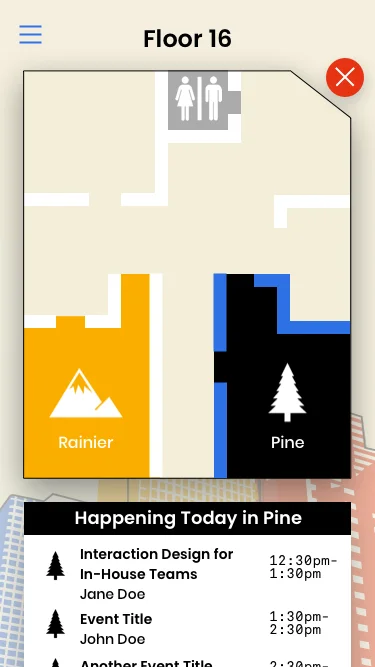

VIRTUAL MAP, TRIVIA & SNAPCHAT INTEGRATION: Research findings informed that attendees expressed the desire for wayfinding, connection, and networking. A virtual map would allow attendees to click on a room location from the event detail page or "Venue Map" from the main menu, and interact with the map floor by floor, room by room, heightening their wayfinding experience.
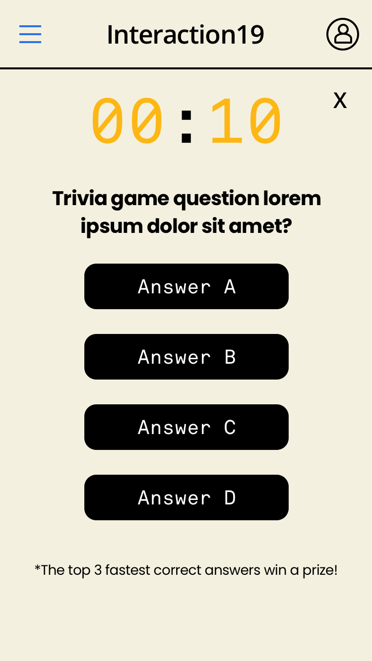
Trivia and Snapchat would be integrated to create engagement at strategic times during the conference to increase connection and networking opportunities when attendees have “free” time between talks, events, and happy hours - morning, noon, and evenings. A custom Snapchat filter with a call to action button on the homepage would drive attendees to share sponsor swag won, or share a selfie that they will look back on and reflect on their Interaction 19 conference experience.
The final prototype can be found HERE. My team and I presented this final design solution and recommendations to IxDA. The client could really see the value in the data visualization feature and is considering implementing it for their events that are streamed worldwide, beyond the conference experience itself.
WHAT I LEARNED
This project taught me about balancing client and user goals. While I had to work to meet IxDA's brief, it was important to stay true to the user research instead of doing a full pivot after the client check-in. I also learned a lot about interfacing with the client, and how to present your work to your associates versus your client.
NEXT STEPS
Given more time, I'd like to iterate further on the following:
More data points and ideas for different visualizations throughout the conference. Would there be an option to show the data visualizations on the attendee's phone, or would that foster less networking and connectivity?
It'd be great to see the trivia idea become more robust. Ideas such as a live leaderboard, challenging fellow attendees 1:1, and countdowns to the next trivia challenge could be implemented.
Dive deeper into the pre-conference experience with clock countdown, pre-conference content, and local events.
Explore the post-conference experience with conference feedback, voting for the next IxDA conference city, downloadable content that has push notifications when keynote presentations become available, photos, etc.


