
Top Pot Doughnuts Redesign
User Interface Design | Information Architecture
Project overview:
Top Pot is a Seattle icon for delicious doughnuts and great coffee, but they've got one major problem - their current website. Top Pot needs a responsive website to allow their customers to browse their delicious offerings from their phone or desktop. The only thing that was off-limits for this project was the company's logo itself.
Role: UX Designer, Visual Designer, Information Architect
Timeline: 5 weeks
Tools: Paper & pencil, Sketch, Adobe Color CC
Skills: Site audit, competitive research, style guide, and visual design direction
SITE AUDIT
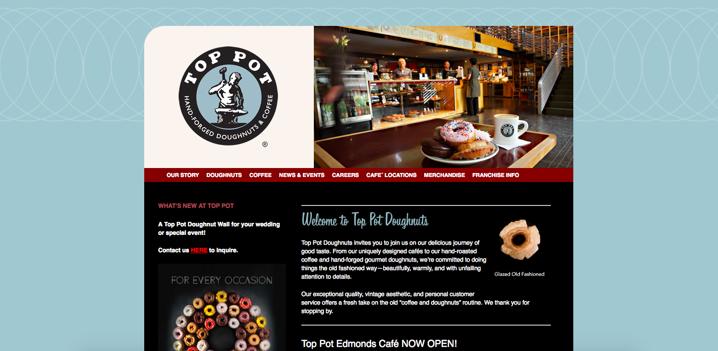
Current Top Pot landing page
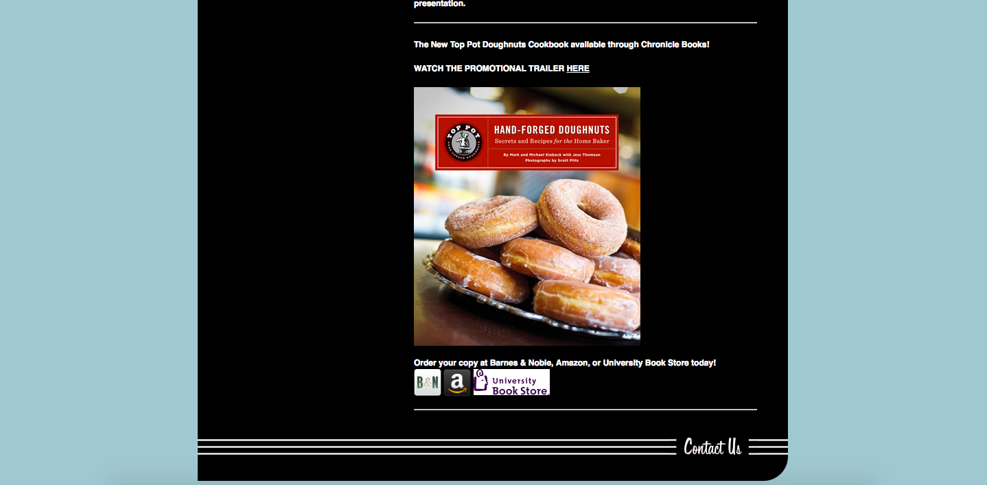
Current Top Pot landing page - bottom of the page
One of the main challenges with the existing Top Pot website is the structure of the site and the layout. It’s not responsive, and there seems to be no real rhyme or reason to the homepage beyond trying to keep their customers up-to-date with the happenings. I noticed they are advertising their book, but it's at the very bottom of the homepage. Little things like this gave the brand lots of opportunities to improve when we began researching top navigation best practices to pair down menu options in order to make the site more digestible for their customers, existing and potential.
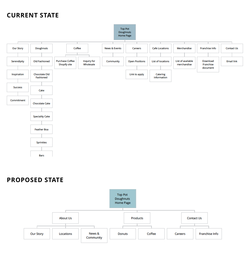
SITE MAP
wireframes & ideation
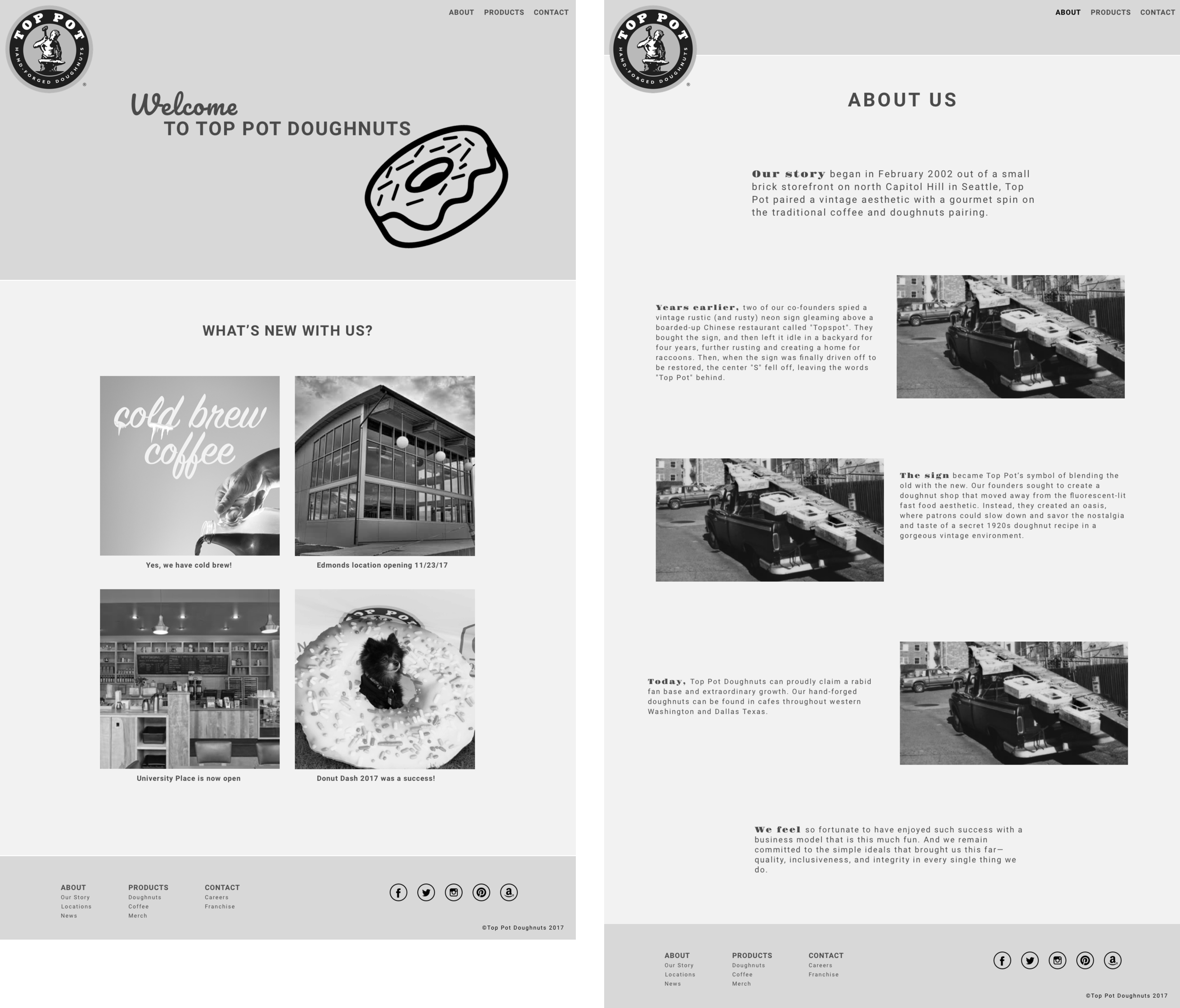
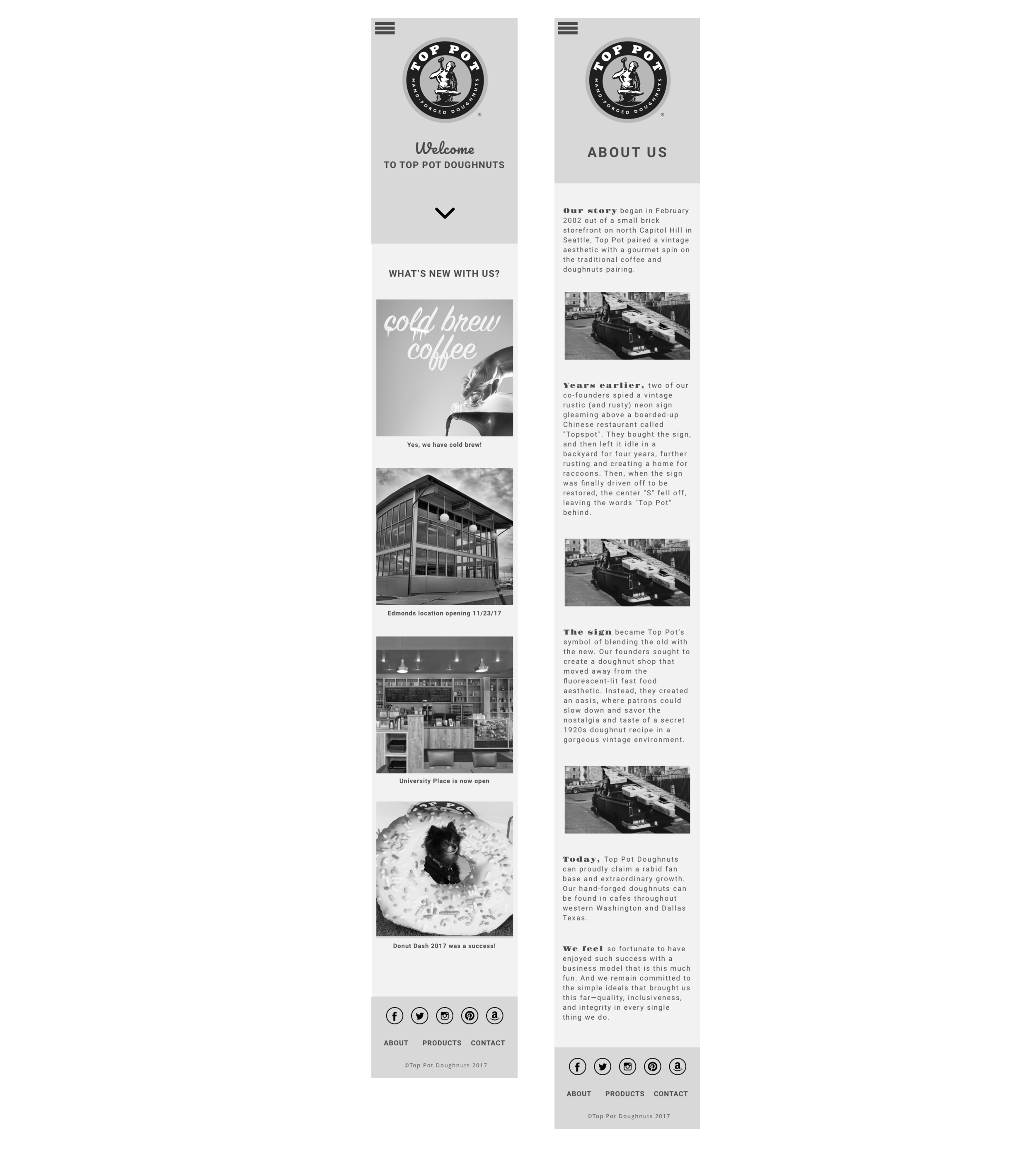
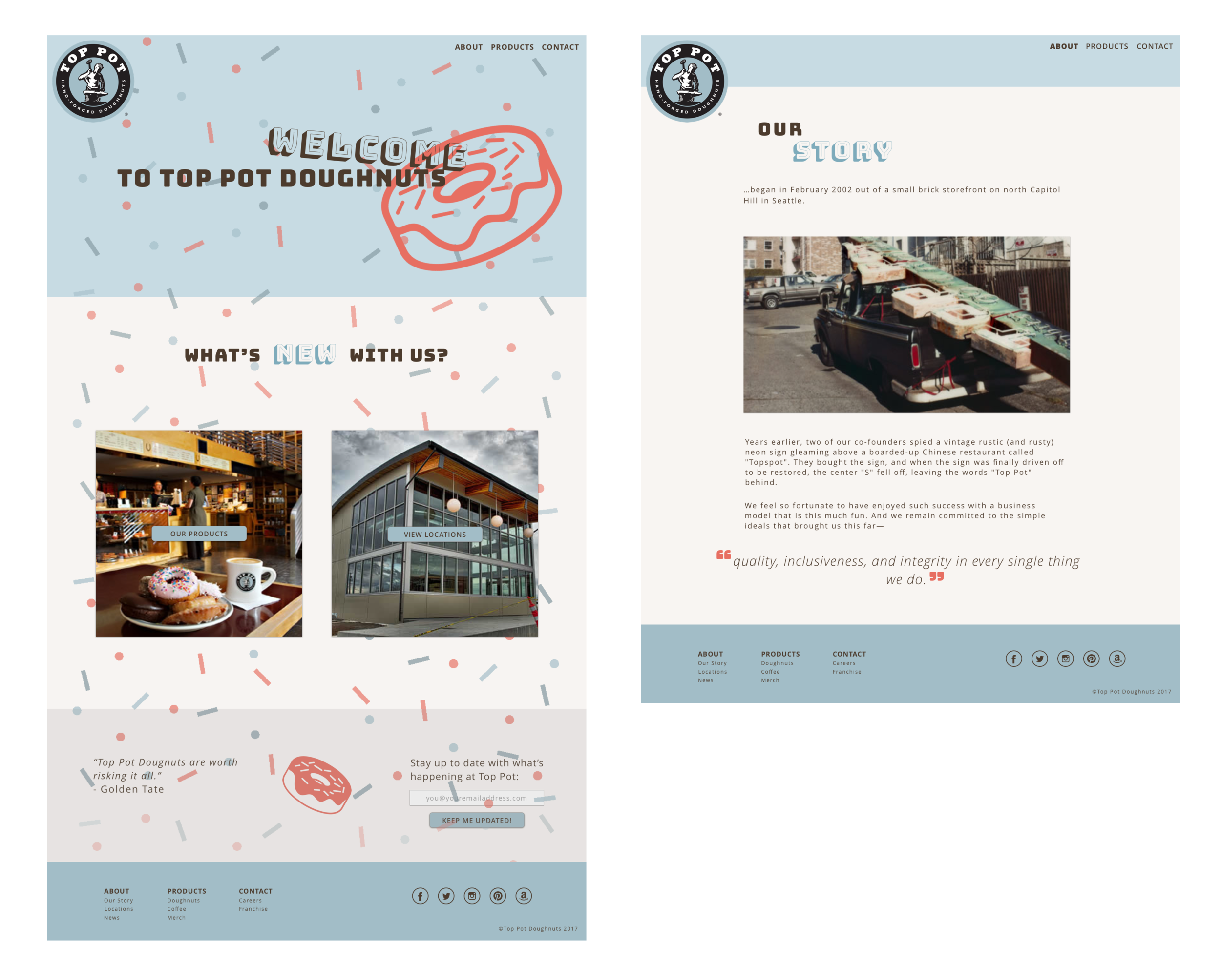
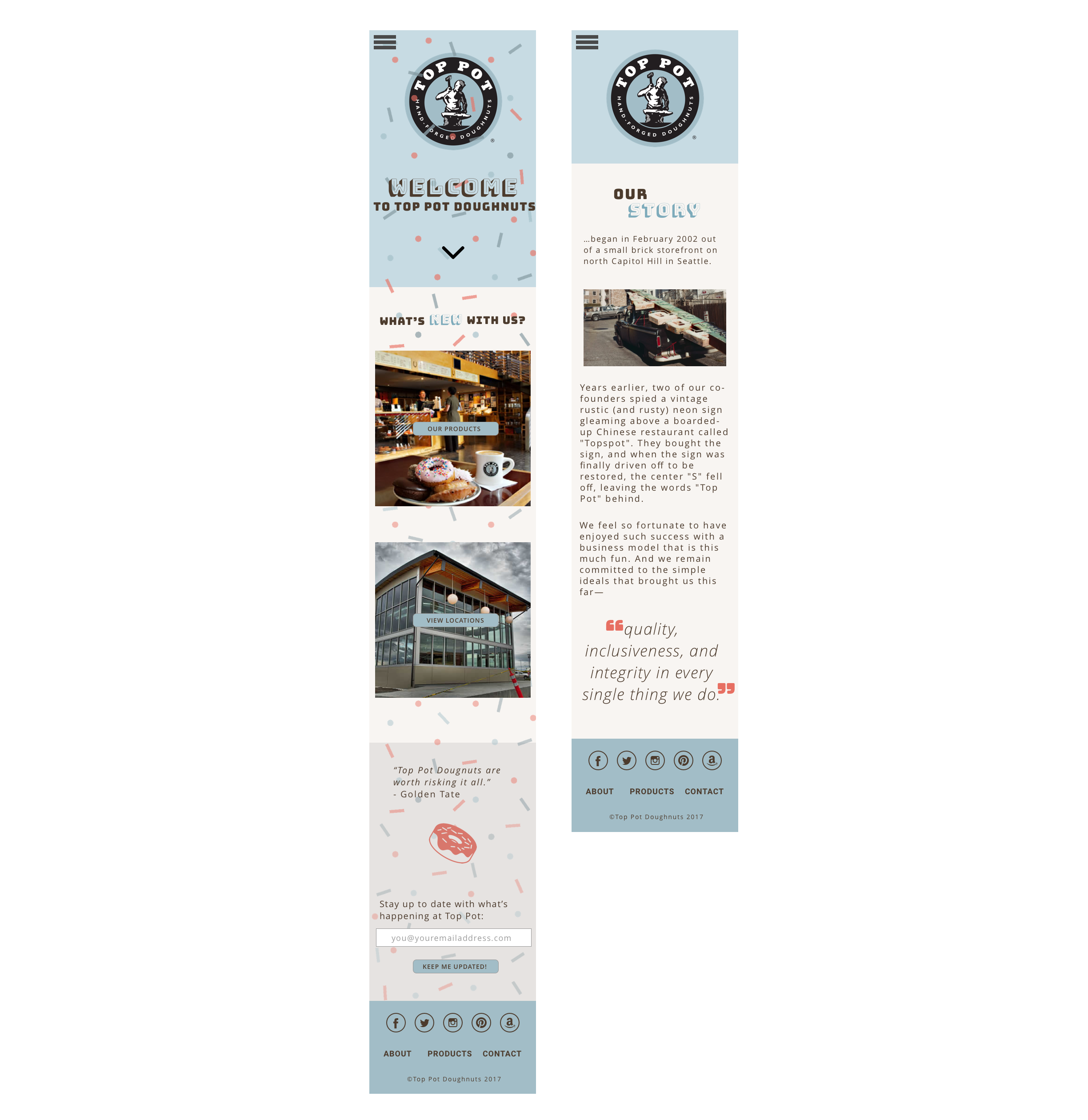
Because of the limited timeframe at hand in our 5-week class, we were only instructed to redesign the homepage and a secondary page. I chose the "About Us" or "Our Story" page as a challenge since it was very copy heavy and the company places a lot of merit on their story. Selecting the "About" page as my secondary page for this redesign was a great lesson for me on visual hierarchy, content management, and strategizing how to think through various layout options while iterating on my design. And a good learning not to be shy about editing down copy where needed!
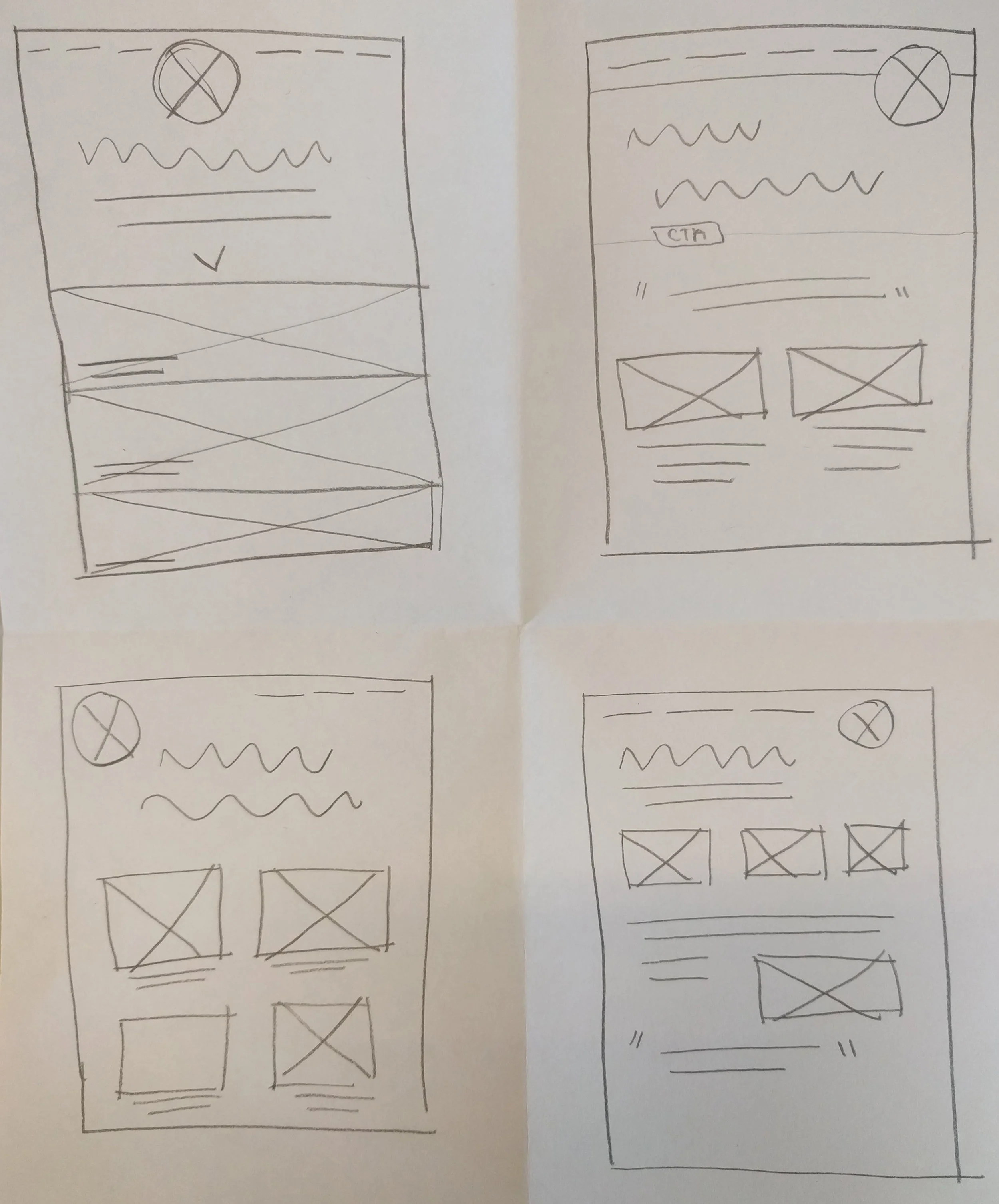
My initial thought process going into wireframes was that the home page would remain as intended, building out a module for news and events that they could edit in the future. On the supporting page, I would keep all copy as is, trying to call out the first few words of each section to begin to play with various options on how to incorporate some sort of hierarchy to the page without actually editing the copy itself.
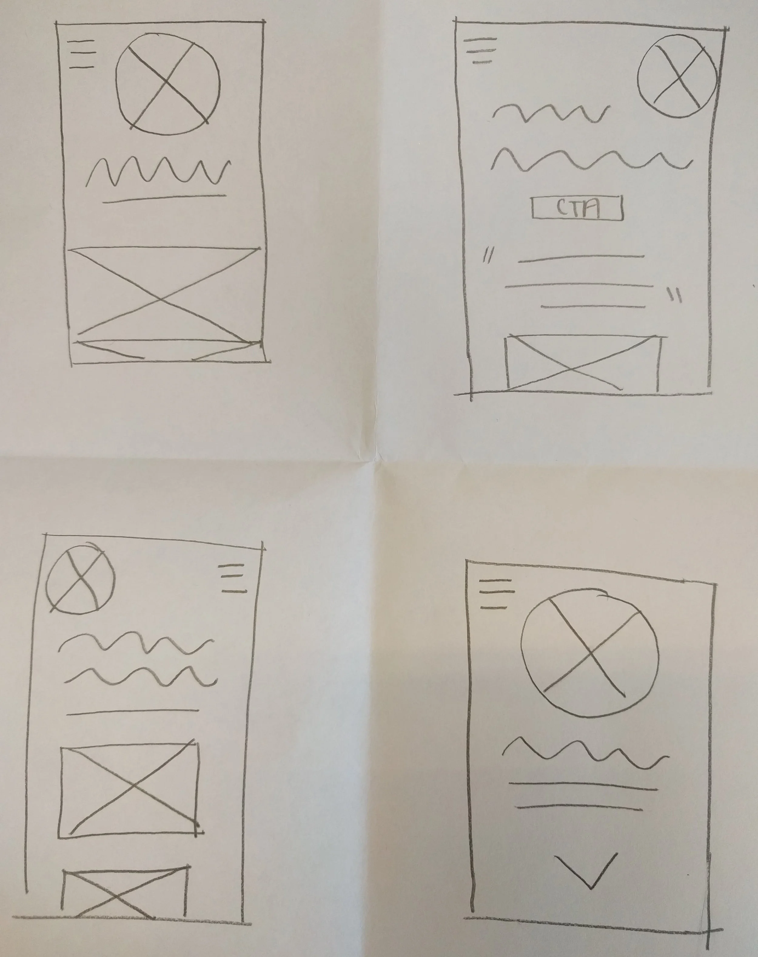
Sketches for mobile first design
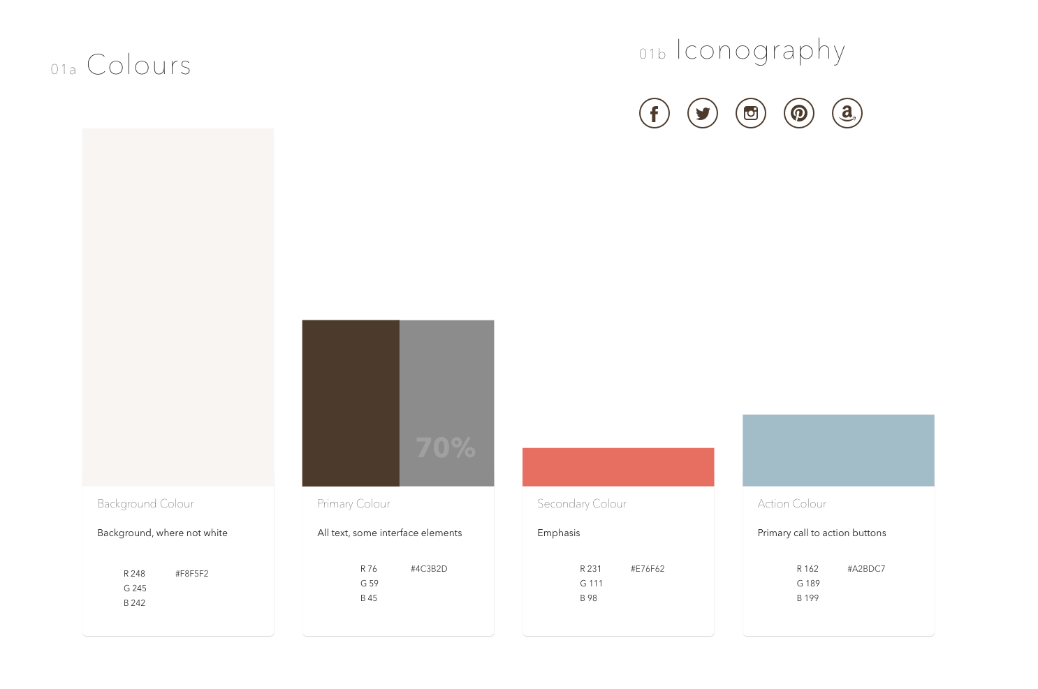
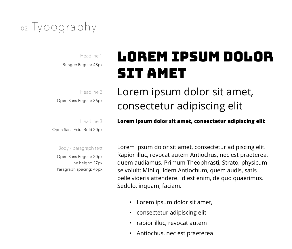
MOOD BOARD & STYLE GUIDE
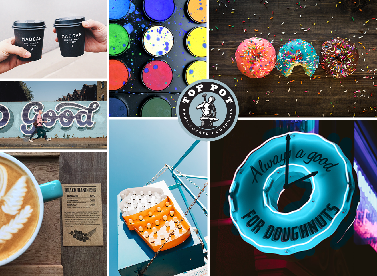
One of my favorite parts of the design process is when you figure out your creative direction, and can start bringing a design to life. I started bringing the design to life by creating a word cloud, then started exploring style through photography, color, typography, and illustration through the mood board above. I knew that I really wanted to continue with the playful style that Top Pot brings to the table, while complimenting the kitschy antique feeling they are so passionate about.
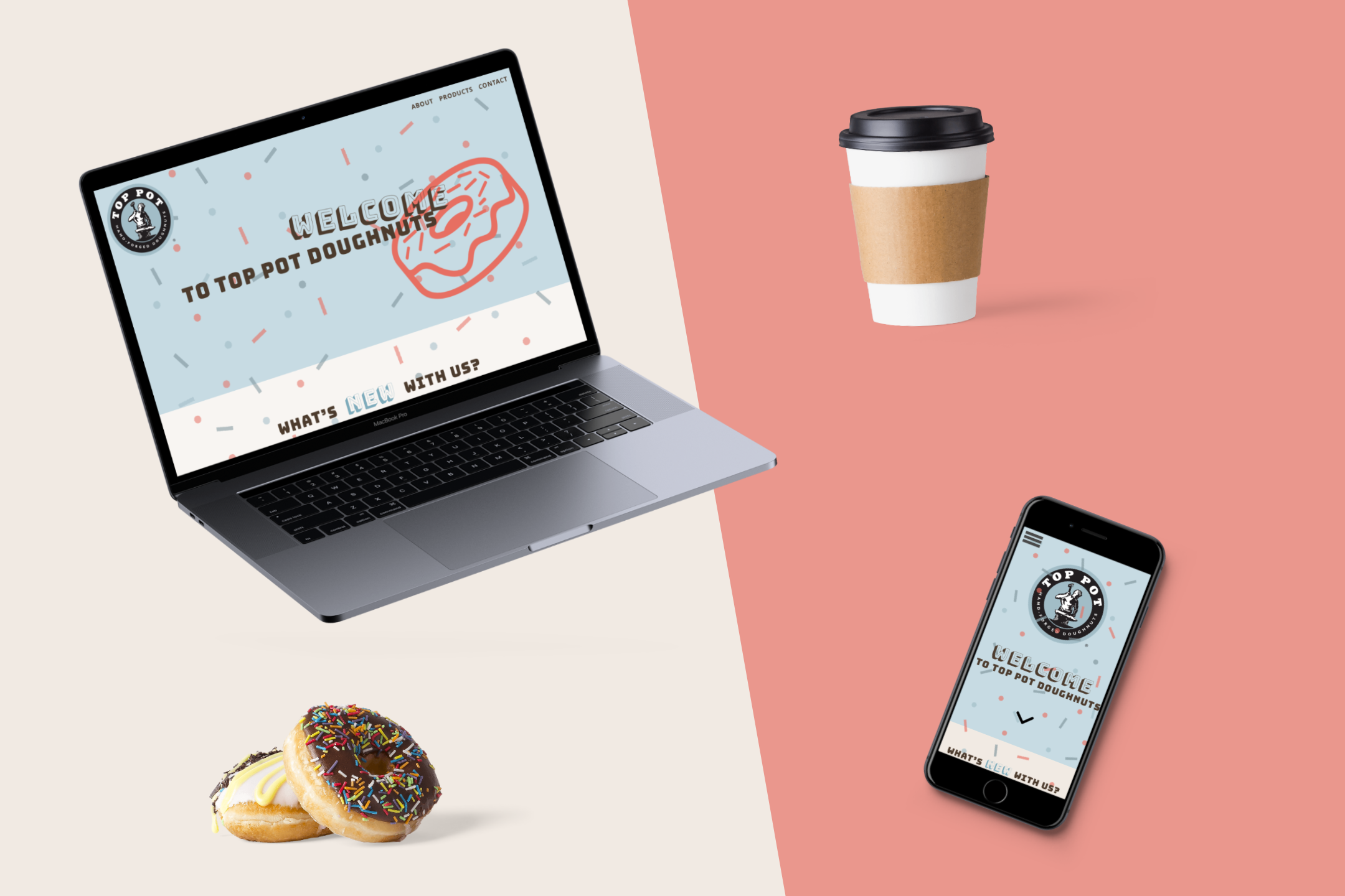
I ended up being most inspired by the sign-painter typography you see above and adding a punch of color to their existing palette to make the overall feel more playful and fun, which really embodies the Top Pot culture.
VISUAL DESIGN
After only four weeks to work and iterate on our wireframes, I was able to draw enough design direction from my mood board and competitive research into Top Pot Doughnuts to come out with version one of my proposed visual designs.
Going into visual designs, I knew that I wanted to give Top Pot a more modern, yet playful feel and function to their website. For example, instead of their current state of linking out to a live email address as a contact option, I wanted to get customers the option to subscribe to Top Pot's email newsletter and positioned it directly next to a satisfied customer's quote.
WHAT I LEARNED
My instructor for this course worked at an agency, so it was really insightful to get a look into the creative process and have our five-week course packed with a complete design cycle. While I really enjoyed doing the visual design itself, I learned that it's invaluable to have set guardrails and actual business goals going into a project like this. Since this assignment was so free-form, there were no set objectives beyond to design a beautiful and delightful responsive user interface.
NEXT STEPS
While there are things that I really enjoyed about this project, there are also things I would love to continue to iterate on and change moving forward.
Usability testing! How do current and potential Top Pot customers respond to the proposed visual design?
Some feedback I was given in our design review was that my use of the darker blue in the footer felt like too many different variants of blue, especially with the different opacity sprinkles thrown in on the home page. An easy fix would be to make the header and footer the same color, but the potential to work deeper on my color palette and solidify the state of the sprinkles themselves. Are they meant to be an interactive element on the page or a solid part of the background?
Begin creating the other supporting pages and start thinking out how the content would be organized and displayed.
The "About Us" page still feels like it needs support. Is there a better way to chunk out the information on the page, or cut the copy down even further? I believe using a pull quote is effective here, but is it the right quote, in the right location? I'd love to test this page with users and see what their response is to the visual hierarchy and content.