
SVC Online Learning Platform
Prototyping | Usability Testing
Project overview:
Online courses are becoming more and more popular these days with our ever-growing busy lifestyles. SVC wants to expand their reach by making courses available online to allow for students to learn when and where works best for their busy schedules.
Role: UX Designer, User Researcher, Prototyper
Timeline: 5 weeks
Tools: Paper & pencil, Sketch, InVision
Skills: Rapid sketching, paper prototyping, user testing and test plan, high-fidelity prototyping, analyzing themes
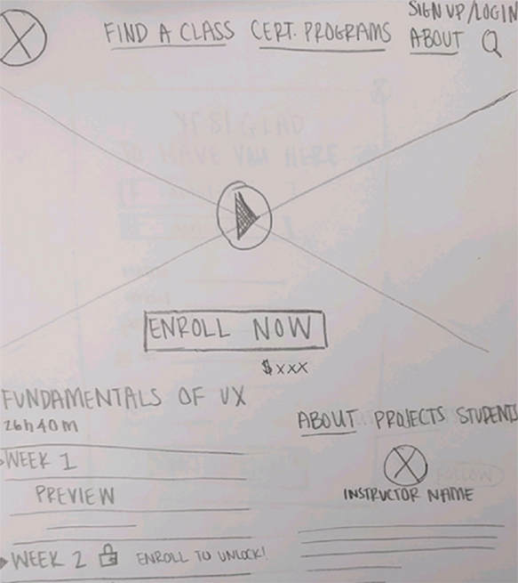
Sketching & defining
A project can go off the rails without clear business goals, requirements, and customer pain points drawn out. I wanted to create clear requirements and define who SVC’s user is, along with some baseline sketches to begin testing with paper prototypes.
Requirements:
SVC's online learning addition..
Must be featured on the home page
Must have access to the courses from SVC home page
Must have a way to preview course content
Must have a section that talks about the course content
Must show what content you can and cannot preview
Needs to show and have the ability to see how easy it is to join

Sketch of enrollment modal window
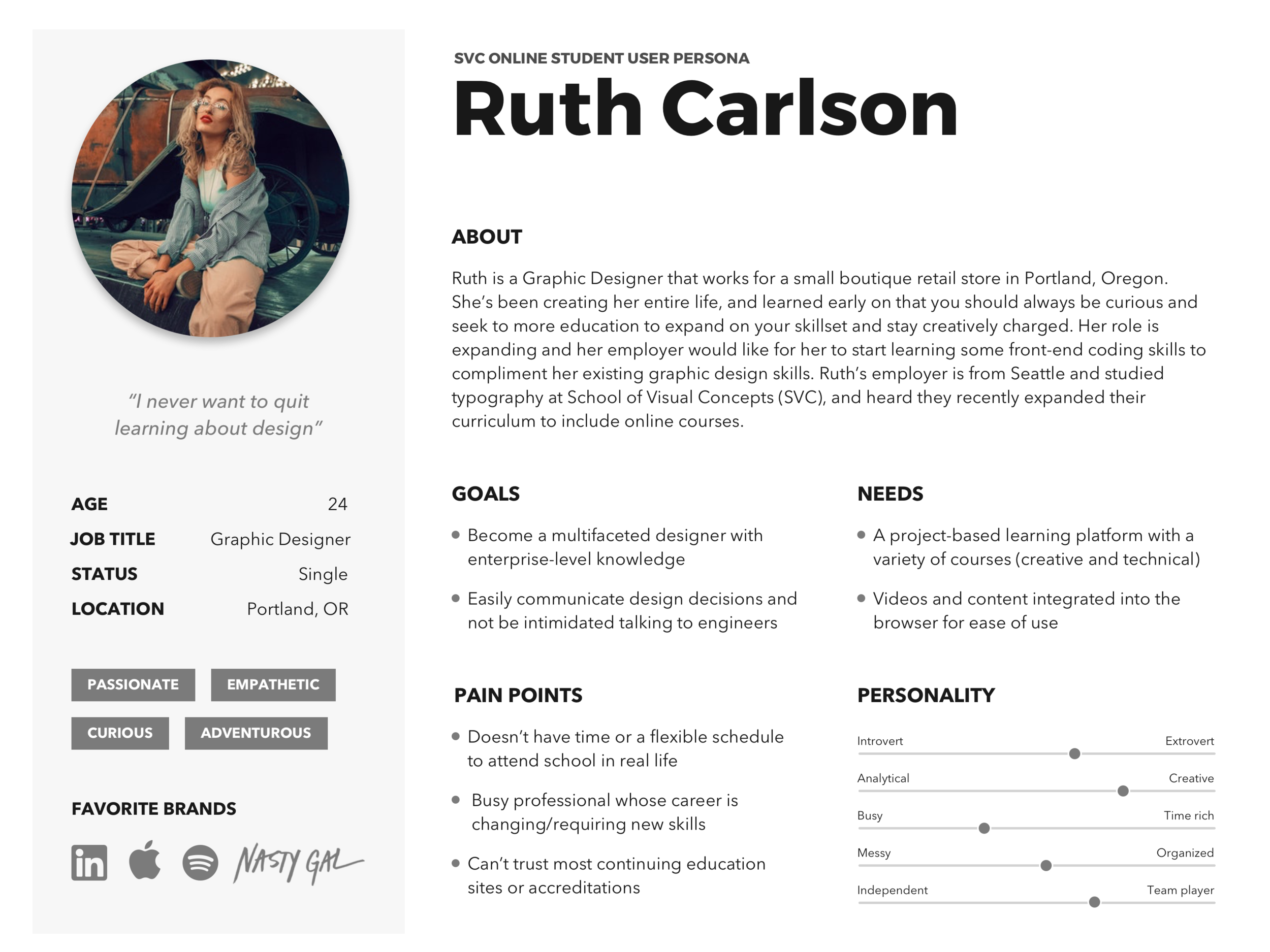
I was able to interview and observe students on-site in order to create a persona for my target user. SVC’s online learner demographic is an artist of sorts already, but looking to expand their arsenal and learn the latest software or technique for that next big opportunity to excel their career.
USABILITY TESTING
Before jumping into testing, I had to nail down testing goals and what flow I would be testing. With the data collected from the observational research and my SVC persona in tow, my testing goal was identified:
"As a new student, I need to be able to easily sign up for a class I'm interested IN"
Based on user feedback, the user flow identified as most crucial was to have the user complete a single class enrollment:
User lands on the homepage
The user sees online classes are available and navigates to a class of interest
User successfully enrolls in a class
In order for the user to get into the context and frame of mind for testing, a testing scenario was created utilizing the Ruth persona from earlier user research:
"Your job is expanding and your employer informs you that SVC has rolled out online courses, one of which is perfect for your new responsibilities at the company, HTML, CSS & Fundamentals of Development. You figure that learning online is a great way to balance your work life and impress your employer with your new skill-set. Sign up for the HTML, CSS & Fundamentals of Development class now."
Metrics for success during testing were task success, time on task, errors, efficiency, and learnability. After running through the screener and doing multiple iterations of testing and iterating on the design based on feedback, it was time to create the high-fidelity prototype.
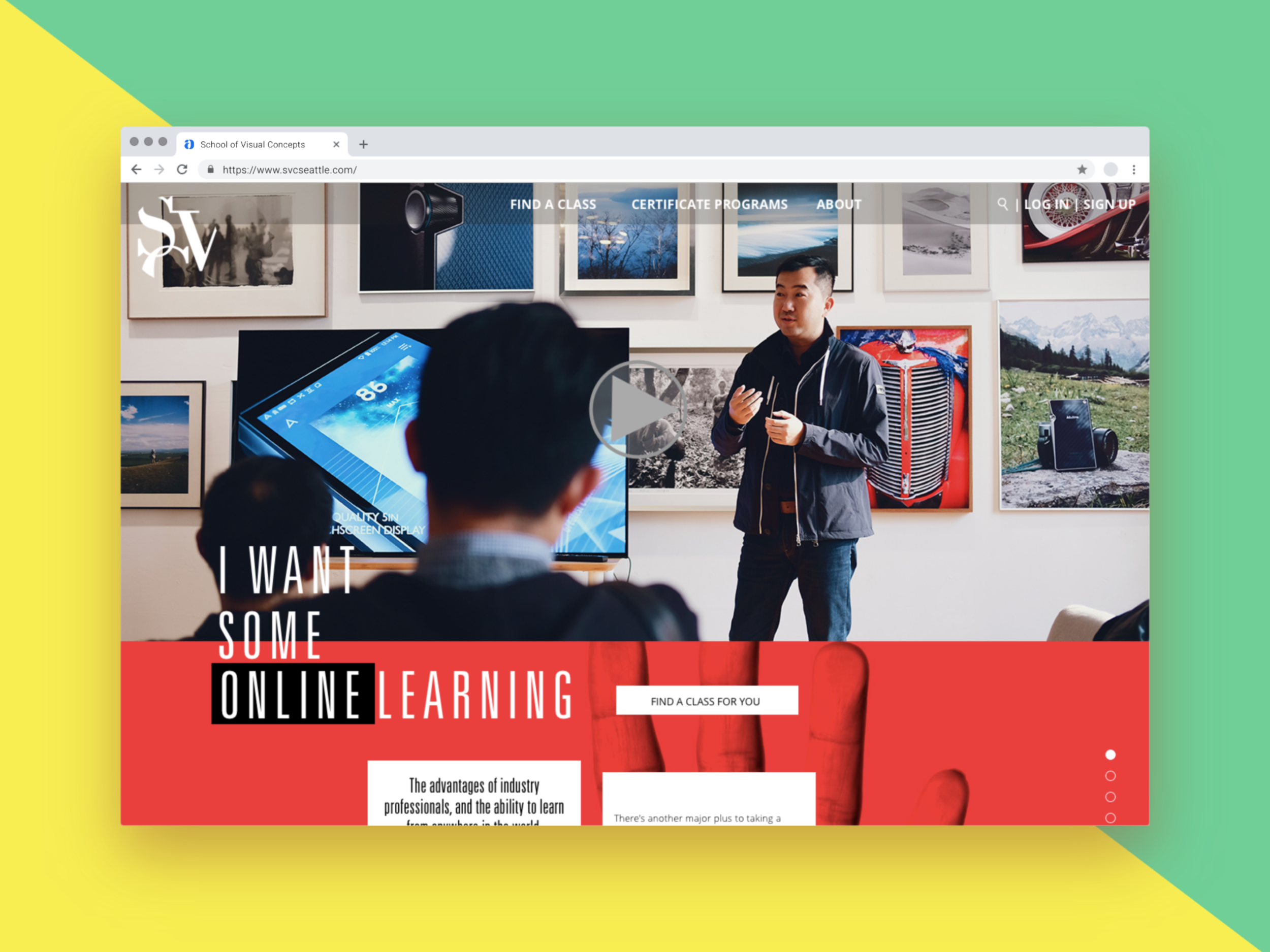
HIGH-FIDELITY PROTOTYPE
After multiple rounds of iteration and testing, the current prototype can be found HERE
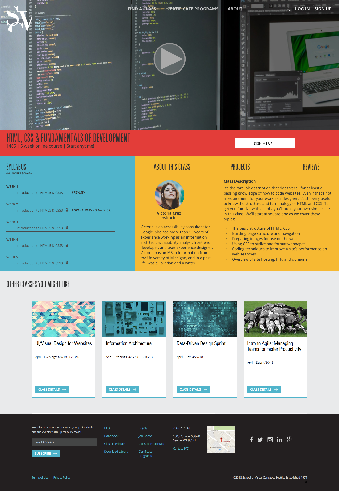
High-fidelity online course page
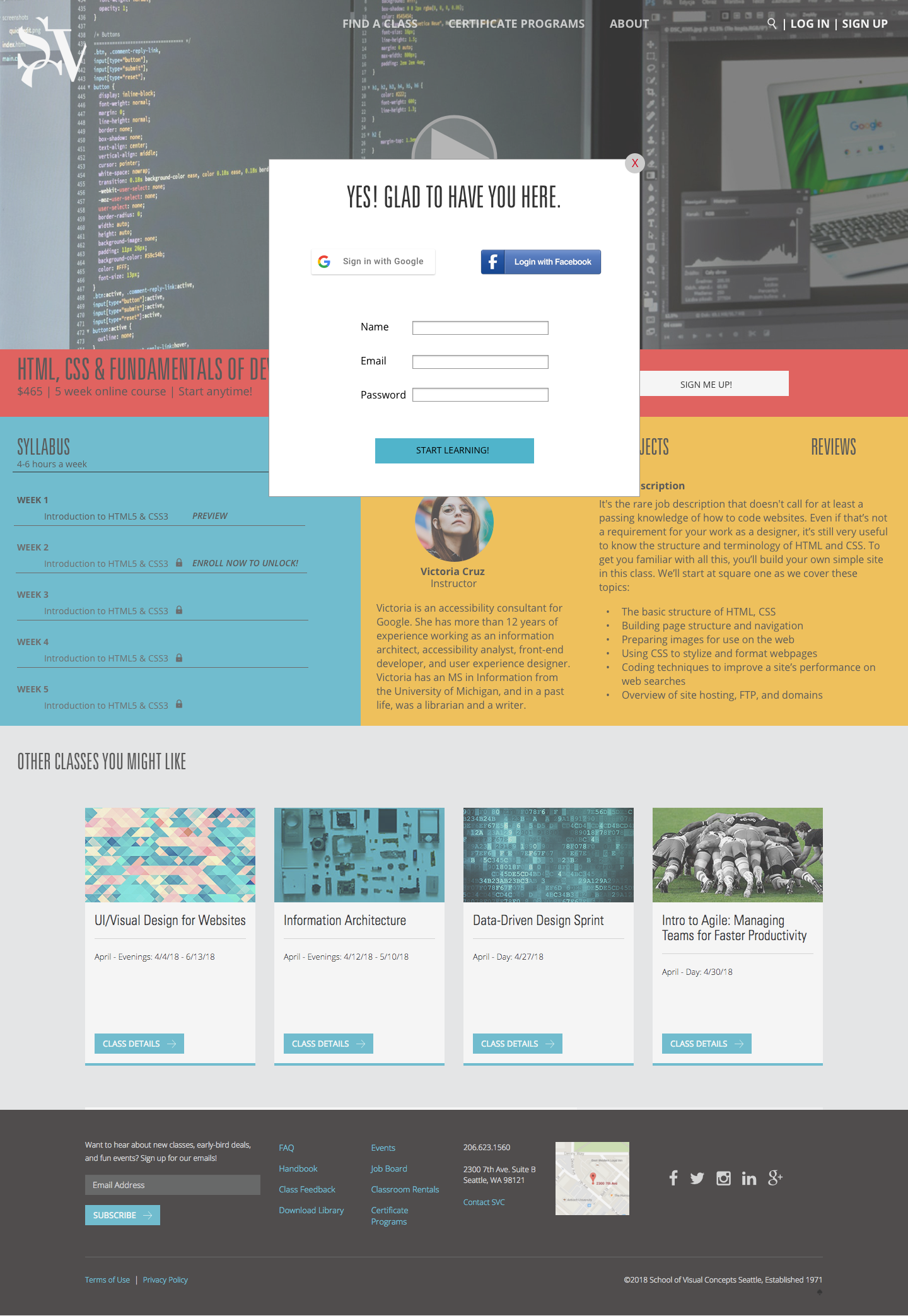
High-fidelity enrollment modal
ANALYZING THEMES
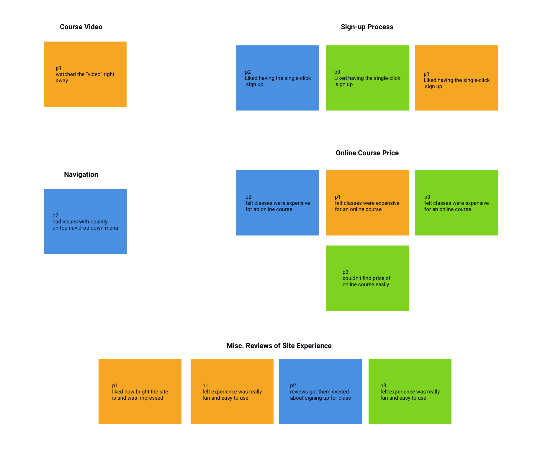
Based on feedback from the latest round of usability tests that were conducted with the high-fidelity prototype, I created an analysis of themes to iterate on and continue to improve the SVC online learning experience.
WHAT I LEARNED
Prototyping can be anything from a simple click-through to prove out a user flow like my final product here, a wireframe with intricate interaction, or even a quick and dirty prototype on printer paper. I learned a lot about how to conduct a usability study, which I'm very excited about. I believe that watching customers interact with your product is invaluable, and should be done early, and often.
NEXT STEPS
I was really excited about this project and was fairly happy with how things turned out. There are still things I wish I had more time during the course duration to flesh out.
Copy is huge here. A lot of the feedback I received from usability testing was that the copy I did have available was really enticing, so I'm beginning to imagine how adding even more copy could assist SVC positively. One user stated that the "friendly greeting is great (upon clicking 'enroll') - it makes me feel good about spending the money!"
I'd love to start thinking about how to implement a student/instructor portal into the SVC website. As you can see, I went beyond my initial scope to include a student page and an instructor page just to begin to play with what that could look like. If SVC were to implement an online learning platform, most of the students that I talked to would love to have visibility to other courses teachers have coming up, and a way to track their current, previous, and future courses themselves.
Price was a deterring factor during usability testing. I had initially utilized the same price as an in-person class at SVC, but most students who tested my prototype commented about how the price was rather high, and they'd expect it to be closer to the $100 range. Next steps here would be to conduct some user research and competitive analysis surrounding pricing of online courses.
Checkout flows can be really complex. I'd love to do more research on checkout flows and conventions so I can have a screen after the one-click enrollment where students enter in credit card and sensitive information. Nobody in my usability studies called this out as missing, but I am aware that it is a crucial part of the sign-up flow and would love to solve for that in the near future.